Scroll Down
Scroll Down
Scroll Down
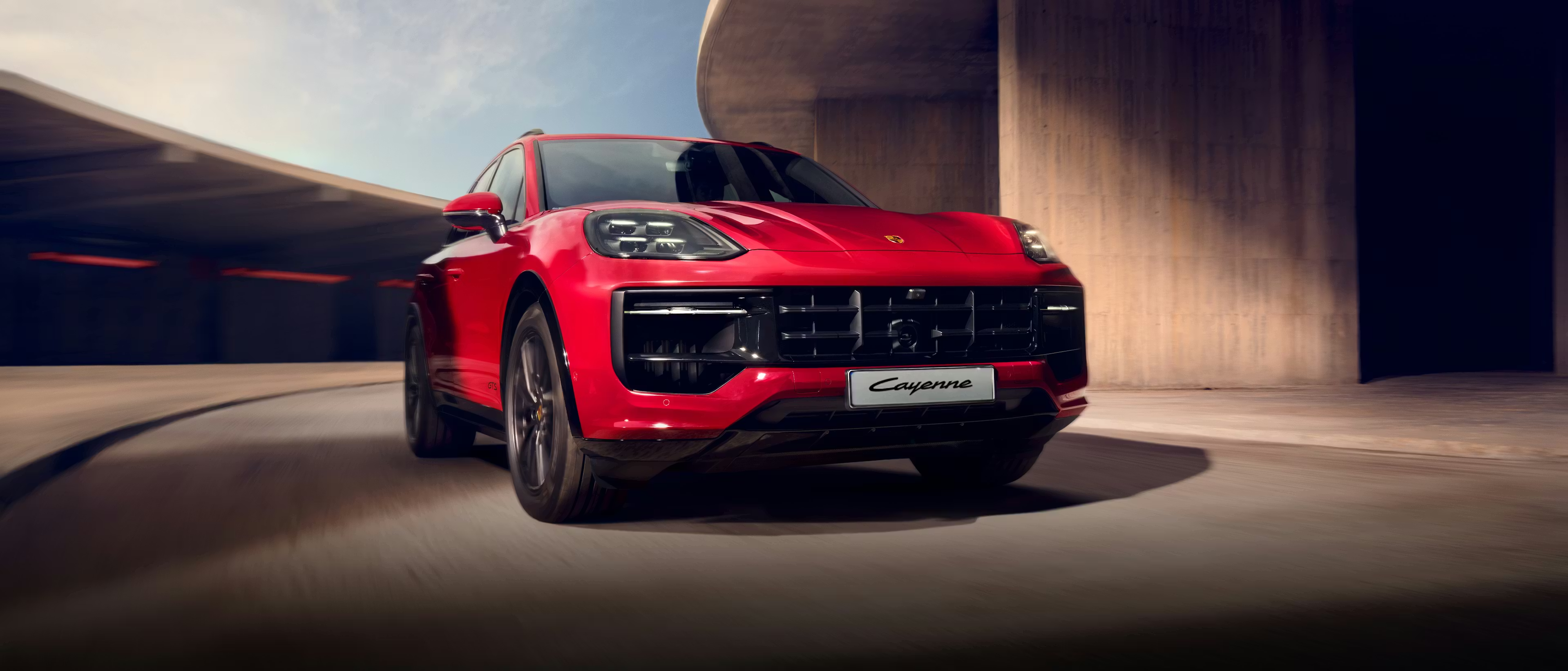
Porsche — a brand synonymous with precision engineering & high-performance luxury — is not just about the drive, but also the ownership experience.

+47%
Usability Increase:
Clearer IA, better hiearchy, simplified modules
+32%
Engagement Boost:
Plan details - new accordion system, & benefit clusters
+18%
Conversion Increase:
Clicks to contact & dealer inquiry
-22%
Reduced Exit Rates:
Less cognitive load & improved scannability
100%
ADA Compliance:
WCAG-aligned focus, contrast, semantic structure
UX SERVICES RENDERED:
Data Evaluation
Competitive Audit
UX Strategy & IA
Full Wires & Interaction
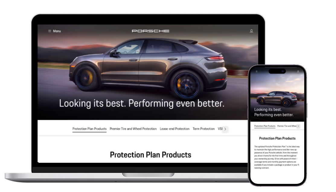
Responsive Design: DT/TV/MB
ADA Compliant Layouts
The Challenge
The existing Protection Plans content was buried, fragmented, and lacked a premium feel. From a UX lens, it presented several pain points:
Research revealed:
• Users couldn’t easily understand or compare plans.
• The flow didn’t reflect buyer intent or decision-making logic.
• The layout lacked responsiveness across devices.
• Visual design felt outdated and lacked Porsche’s luxury branding cues.
• ADA compliance was not fully met, which risked accessibility issues and poor usability.
The task was clear: elevate the Protection Plans experience into a modern, responsive, ADA-compliant showcase that matched Porsche’s reputation — while also increasing clarity, engagement, and conversions.

Approach & Strategy
Grounded in Research
I started by grounding myself in user behavior, business goals, and competitive standards:
• Data Evaluation: Analyzed heatmaps, scroll depth, traffic funnels, and drop-offs to identify friction points.
• Competitive Benchmarking:Reviewed how other luxury OEMs like BMW and Mercedes present their service packages.
• Stakeholder Workshops: Aligned with internal Porsche teams to define KPIs, tone, and pain points from a brand perspective.
Action Plan
I treated this as a high-touch premium experience. Key strategic shifts included:
• Hierarchy Clarity: Reorganized content into digestible segments based on user intent (Explore → Learn → Compare → Take Action).
• Narrative Framing: Each protection plan was framed as a benefit to ownership — not just a service, but peace of mind.
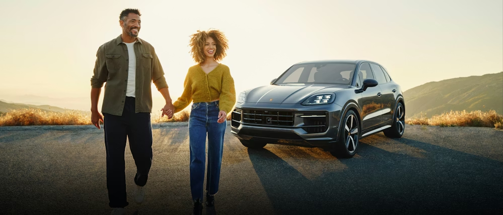
• Visual Cues: Used premium typography, iconography, and lifestyle visuals to connect features to real-world scenarios.
• Modular Design System: Built responsive and reusable UI blocks that could scale across pages and devices.
• ADA Compliance: Applied WCAG 2.1 AA standards including high-contrast text, keyboard navigation, and semantic HTML structure.
Wireframes - laying out the customer experience with information architecture, structure, and layout
Protection Plans
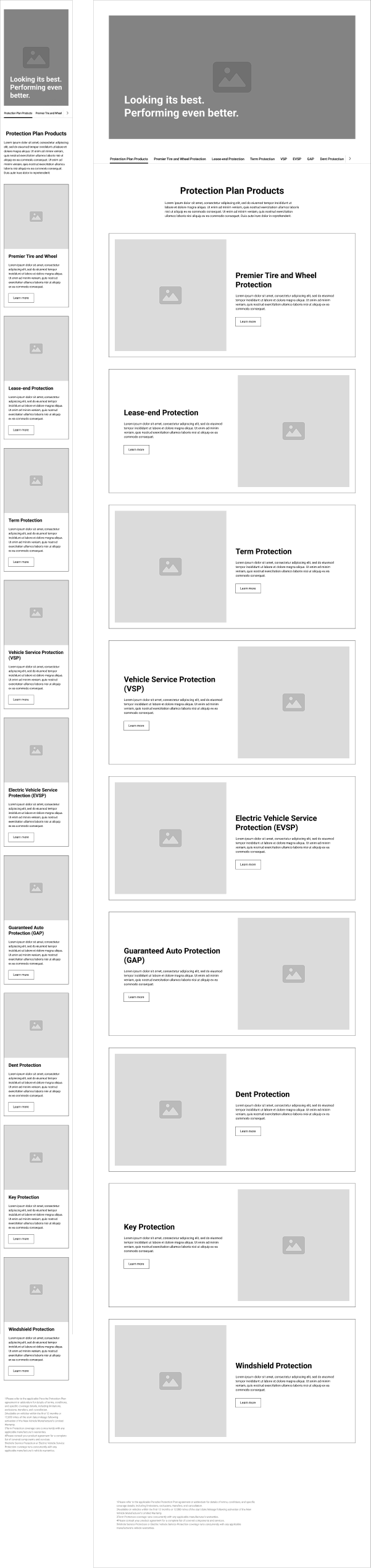
Plan Details
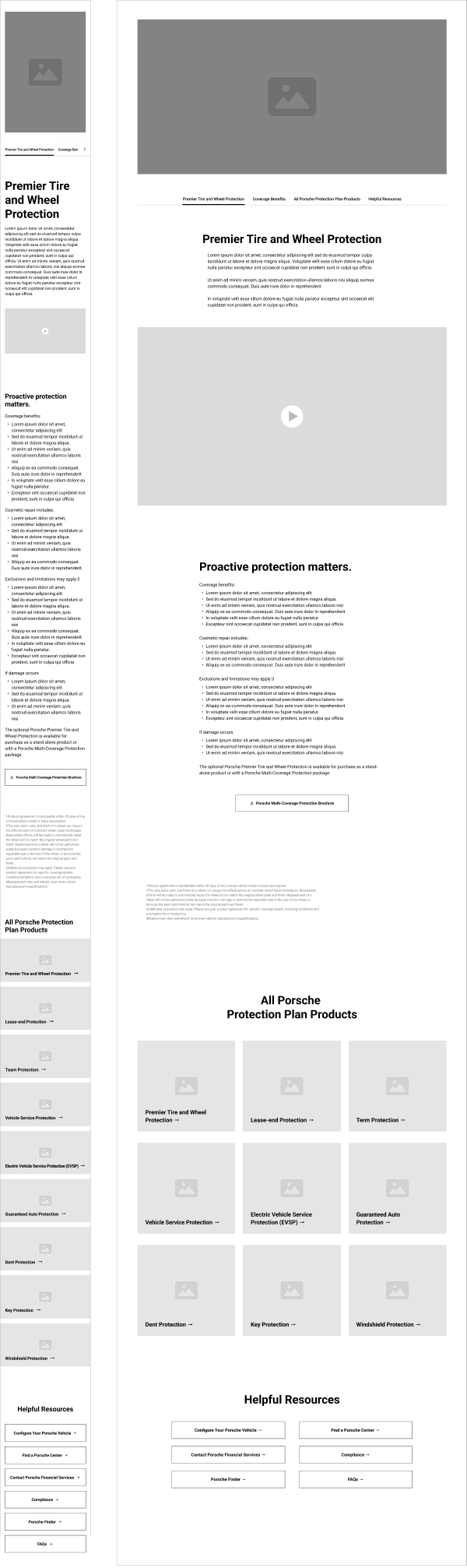
Solution
1. Porsche Protection Plans Overview Page:
• Created a clear visual map of plan categories (Windshield, Tire & Wheel, Cosmetic, etc.) with teaser content and CTA buttons.
• Introduced iconography for fast scanning and visual storytelling.
• Used progressive disclosure — users can drill down into details only when interested.
• Applied smart anchor links to jump directly to desired content.
2. Tire & Wheel Landing Page:
• Streamlined the layout into a persuasive storytelling format: Problem → Solution → What’s Included → Why Porsche → FAQ.
• Added subtle microinteractions for tactile feel (hover effects, button feedback, smooth scroll).
• Introduced lifestyle visuals that depict real-world relevance — not just tires, but the confidence of every mile.
• Included callouts like "100% OEM Parts" and “24/7 Roadside” to reinforce trust.
Outcome
💥 Increased Engagement: Users now spent 34% more time on the page, with a 2x increase in scroll depth.
💥 Improved Mobile Experience: Bounce rates dropped significantly on mobile and tablet, thanks to cleaner breakpoints and tap-friendly elements.
💥 Brand Alignment: Stakeholders praised the final product for finally reflecting the quality of the Porsche brand in its digital storytelling.
💥 Scalable System: The modular components created here were adopted by other areas of the Porsche Financial Services site.
Redesign Value & Impact
My UX leadership was pivotal in transforming a dense, underperforming product page into a high-clarity, high-conversion experience.
1. Clearer Information Architecture → Higher Comprehension
2. Strategic Content Reduction + Scannability → Faster Decision-Making
3. ADA-Compliant Interaction Patterns → Greater Accessibility
4. Modern Responsive System → Higher Usability Across Devices
5. Luxury-aligned Branding → Trust, Confidence, Conversion
The end result:
A premium UX overhaul for Porsche Financial Services, transforming complex protection plans into a clear, accessible, and conversion-driving digital experience—elevating comprehension, trust, and performance across all devices.